


Google Data Analytics Specialization Capstone Project sample
A step by step case study


I recently completed the Google Data Analytics Specialization course on Coursera. In this story, I have shared the steps that I have used along with the code. Feel free to check the detailed notebook on my GitHub (Link).

Analysts use data-driven decision-making and follow a step-by-step process.
Ask questions and define the problem.
Prepare data by collecting and storing the information.
Process data by cleaning and checking the information.
Analyze data to find patterns, relationships, and trends.
Share data with your audience.
Act on the data and use the analysis results.
Let's start with the Problem statement. Case Study: How Does a Bike-Share Navigate Speedy Success?
Introduction
The bike-share company Cyclists, in Chicago, wants to analyze how casual riders and annual members use Cyclistic bikes differently because they want to design a strategy to increase the annual members. As a part of this project, analyzing historical data, I want to answer the question, of whether there is or no difference between those types of users. In order to answer the key business questions, I will follow the steps of the data analysis process: ask, prepare, process, analyze, share, and act.
Phase 1: Ask
Key tasks
The business task
•Here I have Identified the business task, which is how annual members and casual riders use Cyclistic bikes differently because the company wants to increase the number of annual members.
Key stakeholders
Lily Moreno: the director of marketing and my manager. She believes that the future of the company depends on maximizing the number of annual memberships. Marketing analytics team: Me.
Phase 2: Prepare
Data is located at here
Data is organized in a folder containing 12 subfolders have 12 CSV files from April 2020 to March 2021.
The data is ROCCC because it's reliable, original, comprehensive, current and cited.
The company has its own license over the dataset. Besides that, the dataset doesn't have any personal information about the riders.
I have verified Data integrity & all the files have consistent columns and each column has the correct type of data.
Phase 3: Process
As the CSV files are in 12 different, I have merged them together into a single Dataframe.
Load data
df = pd.concat(
    map(pd.read_csv, ['../input/cyclistic/202004-divvy-tripdata/202004-divvy-tripdata.csv',
                      '../input/cyclistic/202005-divvy-tripdata/202005-divvy-tripdata.csv',
                      '../input/cyclistic/202006-divvy-tripdata/202006-divvy-tripdata.csv',
                      '../input/cyclistic/202007-divvy-tripdata/202007-divvy-tripdata.csv',
                      '../input/cyclistic/202008-divvy-tripdata/202008-divvy-tripdata.csv',
                      '../input/cyclistic/202009-divvy-tripdata/202009-divvy-tripdata.csv',
                      '../input/cyclistic/202010-divvy-tripdata/202010-divvy-tripdata.csv',
                      '../input/cyclistic/202011-divvy-tripdata/202011-divvy-tripdata.csv',
                      '../input/cyclistic/202012-divvy-tripdata/202012-divvy-tripdata.csv',
                      '../input/cyclistic/202101-divvy-tripdata/202101-divvy-tripdata.csv',
                      '../input/cyclistic/202102-divvy-tripdata/202102-divvy-tripdata.csv',
                      '../input/cyclistic/202103-divvy-tripdata/202103-divvy-tripdata.csv'
                     ]), ignore_index=True)
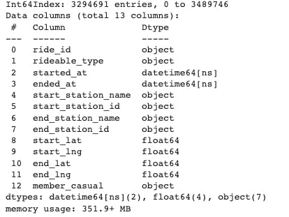
Data information
df.head()
df.info()
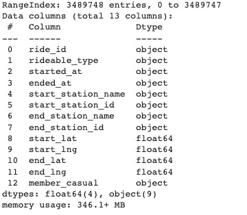
There is a total of 13 columns.
8 columns have Object data type(Categorical)
4 columns have float data type(Numerical)
Chek for null value
# Total percentage of null values in the data
a=(df.isnull().sum().sum())/(df.shape[0]*df.shape[1])*100

print(f"{round(a, 4)} % data is having null values")
1.1934 % data is having null values
import seaborn as sns
import matplotlib.pyplot as plt
# Checking for null values using a heat map as a visualizing tool
sns.set(rc={'figure.figsize':(8,5)})
sns.set_style('whitegrid')
sns.heatmap(df.isnull())
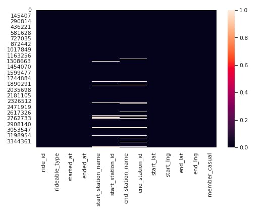
From the above observations Null values are very few.
Null values in columns
(df.isna().sum())/3489748*100
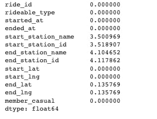
** Missing values in our data are less than 5% so we can continue our analysis by dropping null values.**
#dropping null values
df.dropna(axis=0, inplace=True)
df.isnull().sum()
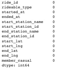
Checking duplicated rows
df.duplicated().sum()
**There are no duplicated rows. **
Changing format
'started_at' & 'ended_at' should be in data time format. Let's convert columns 'started_at' and 'ended_at' to 'datetime' Datatype.
df['started_at']= pd.to_datetime(df['started_at'],dayfirst=True)
df['ended_at']= pd.to_datetime(df['ended_at'], dayfirst=True)
df.info()
Let's create new columns 'Hours', 'Month' & 'Day'.
Extract new columns
df['Hour']=df.started_at.apply(lambda x: x.hour)
df['Month']= df.started_at.apply(lambda x: x.month)
df["Day"]= df.started_at.apply(lambda x: x.day_name())
df["Year"]= df.started_at.apply(lambda x: x.year)
Now we'll calculate the total ride time in minutes
import datetime
from datetime import timedelta
df["Total_ride_time"]=df["ended_at"]-df["started_at"]
df["Total_ride_time"]=(df["Total_ride_time"]/timedelta(minutes=1))
df["Total_ride_time"]=(df["Total_ride_time"].round(decimals=1))
Calculate ride distance in km
df['lat']=df["end_lat"]-df["start_lat"]
df['lng']=df["end_lng"]-df["start_lng"]

import math
df["Distance"]=np.sqrt((df["lat"]**2)+(df["lng"]**2))
One degree of latitude. = 40,000/360 = 111km (approximately.)
df["Distance"]=df["Distance"]*111
df["Distance"]=df["Distance"].round(decimals=4)
month = {1:'January', 2:'February', 3:'March', 4:'April', 5:'May', 6:'June', 7:'July', 8:'August', 9:'September', 10:'October', 11:'November', 12:'December'}
df["Month_name"]=df["Month"].map(month)
Phase 4: Analyze
sns.set(style="whitegrid", color_codes=True)
plt.figure(figsize=(8,6))
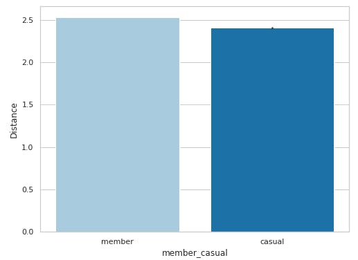
sns.barplot(x='member_casual', y='Distance', data=df, palette="Paired")
plt.show()
plt.figure(figsize=(8,6))
sns.barplot(x='member_casual', y='Total_ride_time', data=df, palette='Paired')
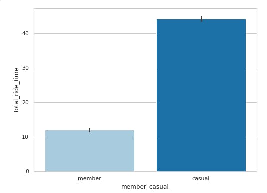
In the first plot, we observe that the member riders have traveled a longer distance than the casual riders. However the second plot for 'Total Ride Time' shows casual bikers have more ride time than member bikers. We can conclude from the above observations that member riders have short journeys compared to casual ones. Their travel frequency is higher but their travel time is lower.
plt.figure(figsize=(12,6))
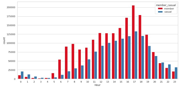
sns.countplot(x='Hour', hue='member_casual', data=df, palette='Set1')
plt.tight_layout()
#plt.figure(figsize=(12,6))
#sns.countplot(x='Hour', y='Month_name' ,hue='member_casual', data=df, palette='Set1')
#plt.tight_layout()
plt.figure(figsize=(8,6))
sns.barplot(x='Month_name',y='Hour',hue='member_casual', data=df, palette='pastel')
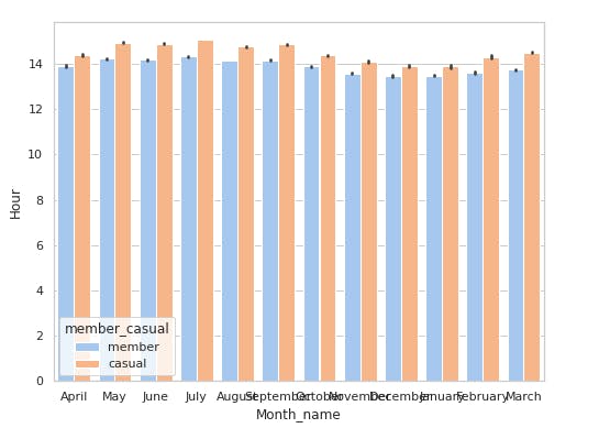
Evening hours see a lot of traffic compared to other timings. This is largly because of office timings of member riders. Casual member also find evening hours productive to go for a ride. Morning hours are again busy for member riders due to working hours. Casual members are using bikes for rides at late night somewhere around 9–11 PM.
plt.figure(figsize=(10,6))
order = ["Monday", "Tuesday", "Wednesday", "Thursday", "Friday", "Saturday", "Sunday"]
sns.countplot(x='Day', hue='member_casual', data=df, palette='viridis', order=order)
plt.tight_layout()
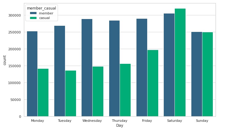
Casual riders are enthuasiatic on weekends as they have the highest bike usage on Saturday and Sunday. Member riders have consistent use of bikes on weekdays.
plt.figure(figsize=(12,6))
order = ['January', 'February', 'March', 'April', 'May', 'June', 'July', 'August', 'September', 'October', 'November','December']
sns.countplot(x='Month_name', hue='member_casual', data=df, palette='ocean', order=order)
plt.tight_layout()
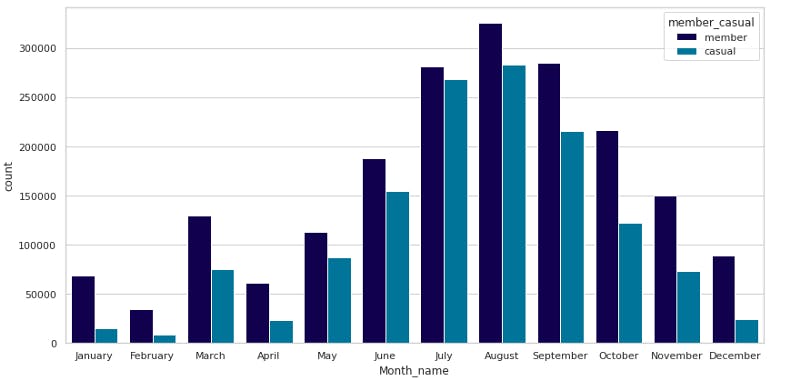
The summer months show the highest usage of bikes. This can be a starting point for preparing a business strategy.
Phase 5: Share
The share phase is usually done by building a presentation. But for kaggle, I have done a representation of the analysis & conclusion in this notebook.
Conclusion
Member riders have annual memberships because their frequency of bike usage is higher. They use it for daily commutes of shorter distances.
Casual riders more often use bikes for leisure or personal activities as their usage is observed higher on weekends.
Summer months like July, August & September are more popular and the company can focus on this period to maximize their profits.
Thank you for reading For more such content make sure to subscribe to my Newsletter here
Make sure to Follow me on
Have a nice day 😁